
SCOP
Revitalized design and user experience for an exclusive consortium of ophthalmology experts, researchers, and scientists.
THE CONTEXT
〰️
THE CONTEXT 〰️
THE PRODUCT
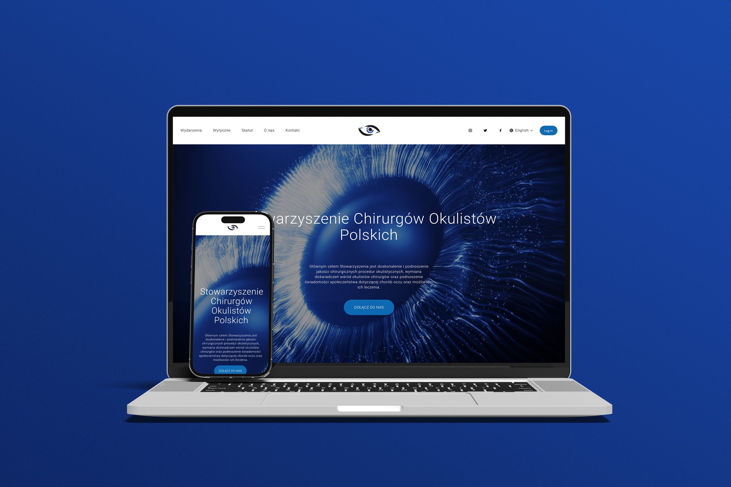
A meticulous overhaul of the SCOP website incorporating nuanced refinements to the brand, aimed at elevating the overall user experience.
THE CLIENT
SCOP, a distinguished association of leading ophthalmologists, serves the dual purpose of disseminating knowledge and advancements within its esteemed network while providing essential expertise to individuals in need.
THE PROBLEM
The previous iteration of SCOP's website was deemed outdated and failed to adequately reflect the esteemed nature of the club. Notably, it lacked full responsiveness and necessitated substantial enhancements in terms of functionality.
THE GOAL
PHASE 1:
Engage in light discovery and requirements gathering.
PHASE 2:
Utilize user-centered design principles to design, test, and iterate a prototype incorporating the solutions identified in Phase 1.
PHASE 3:
Develop and integrate the website with the client’s servers
PHASE 4:
Implement the website and train SCOP staff to use it.
PROJECT DURATION
March 2023 - December 2023
MY ROLE & MY RESPONSIBILITIES
Lead UXer
Paper and digital wire-framing, low and high-fidelity prototyping, accounting for accessibility, iterating on designs, responsive design, testing and iterating the product, and graphic design.
Website developer
Leveraging prototypes as a foundational framework to construct the website, ensuring the integration of essential functionality.
THE PROCESS
〰️
THE PROCESS 〰️
I implemented Design Thinking. Our goal was to incorporate all five stages in the process: Emphasize, Define, Design, Prototype, and Iterate.
EMPATHIZE & RESEARCH
USER RESEARCH
My research
My objective for this research was to:
Gain a thorough understanding of the client’s goals and needs
Identify pain points in the current website
Understand how users think, navigate, and what they look for on the website
Defining the club’s brand
Foundational Research:
Gaining a comprehensive understanding of the association's operations and discerning the specific requirements of its members constituted a fundamental aspect of my research. In lieu of one-on-one sessions with members, user expectations were conveyed to me through the designated brand representative.
Research Deep-Dive :
In pursuit of more granular data, I meticulously examined the predecessor website, conducting an exhaustive analysis of its content, strengths, and weaknesses.
Research Outcome:
Throughout this investigative process, I adeptly identified the predominant environments in which our users actively participate, discerned the tools integral to their engagement, comprehended their routines, challenges, and expectations. Leveraging this valuable insight, I systematically categorized our user base into three distinct groups: members, prospective members, and business partners.
USER RESEARCH SUMMARY
The prevailing design exhibited a deficiency in intuitiveness, largely attributed to the haphazard dissemination of excessive information. The content, characterized by density and inadequate spacing, significantly compromised the overall user experience.
Additionally, the website failed to meet the accessibility standards outlined in the WCAG 2.1 guidelines, and its content management system (CMS) incorporated outdated editorial tools. Furthermore, a lack of optimization for mobile devices dissuaded a considerable user segment from accessing the website via their phones. Moreover, the design lacked congruence with the SCOP brand identity, displaying a lack of cohesion with the overarching brand aesthetics.
COMPETITIVE AUDIT
In my research, I divided our competitors into two groups: direct and indirect. I then analyzed them based on first impressions, Interaction and Functionality, Visual Design, and Content.
Key Take-Aways:
Our industry counterparts articulate their brand identity with greater clarity.
Our competitors boast websites that are more responsive and adaptive to user interactions.
Our competitors present more comprehensive information concerning the events and social engagements hosted by their respective clubs.
IDEATION
Through diligent research, it was discerned that a substantial portion of our user base predominantly utilizes laptops for website access. Accordingly, the website redesign adopted a desktop-first design methodology. In order to ensure optimal responsiveness for mobile devices, aligning with user preferences, I meticulously developed a series of paper wireframes utilizing a 12-row grid system. These wireframes proved instrumental in brainstorming the optimal placement of key functions and determining the most intuitive navigation pathways.
DEFINE PROBLEMS AND OPPORTUNITIES
KEY (AGGREGATED) PAIN POINTS
Outdated design not representative of an elite world-class group of doctors, researchers, and scientists
Lack of responsiveness
Lack of a captivating user journey
PRIORITIZATION OF ISSUES
The process of prioritization was based on the most requested features and most common pain points we learned about during the research phase.
Intuitive navigation
Clean & uncluttered design
Engaging and captivating user journey
Responsive design
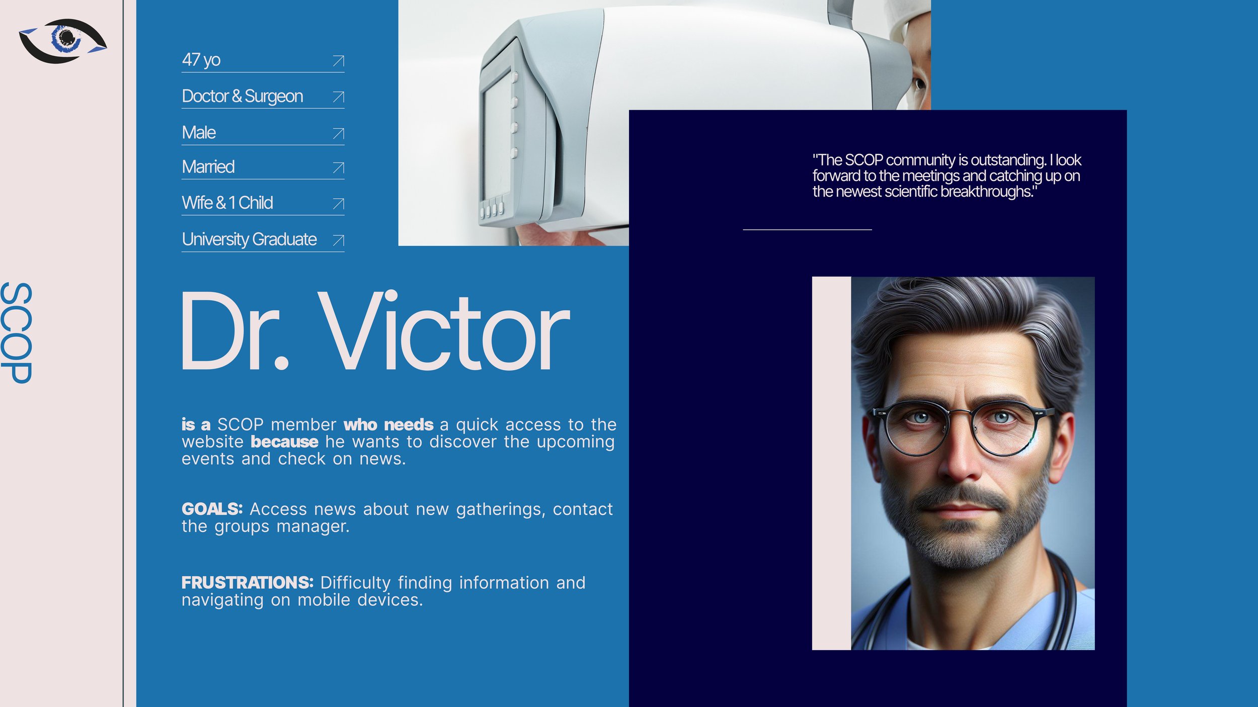
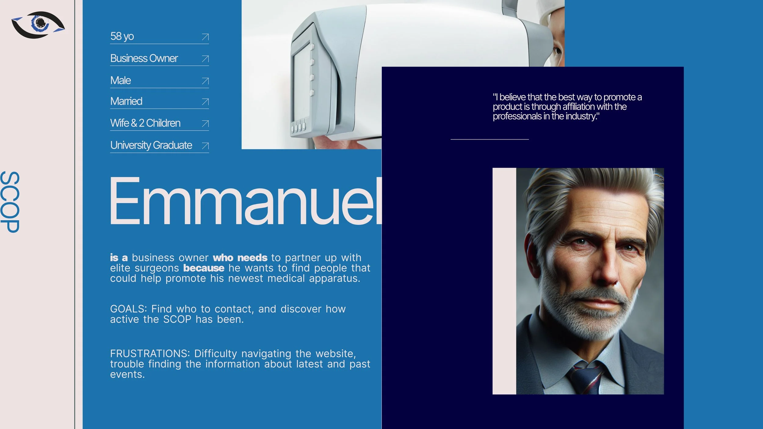
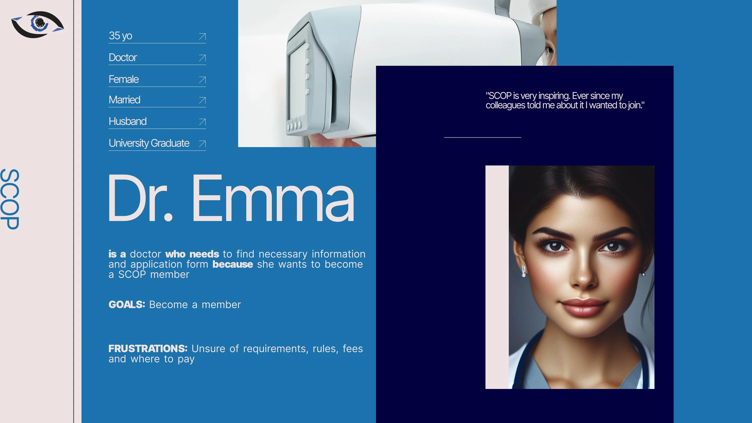
PERSONAS
Crafting different personas helped me visualize user needs discovered in user research.
PROBLEM STATEMENTS
Victor is a SCOP member who needs quick access to the website because he wants to discover upcoming events and check on the news.
Dr. Emma is a doctor who is looking for the necessary information and an application form because she wants to join the SCOP group.
Emmanuel is a business owner who wants to partner up with elite surgeons because he wants to find people who could help promote his newest scientific product.
IDEATE, PROTOTYPE, TEST
DIGITAL WIREFRAMES

Key Assumptions:
The user flow necessitates an intuitive, informative, streamlined, and engaging experience.
As SCOP continues to grow and incorporate new specialists, it is imperative that the website remains scalable, responsive, and adaptable to dynamic changes.
PHASE 2: HIGH FIDELITY

SCALABILITY
The prototype was designed with responsive capabilities, ensuring a seamless transition between mobile and desktop devices. It has also been tested for readability at scaled resolutions up to 200%.
ACCESSIBILITY
The website was crafted to meet the needs of WCAG 2.1.
PROCESS LEARNINGS
〰️
PROCESS LEARNINGS 〰️
TAKEAWAYS
Knowing something and understanding something are very different things. During the process of this website creation, I understood how clients want the best for their product but sometimes do not fully grasp why some changes are made and intuitively stir the designer towards what they know or are familiar with. Very often that is the previous design.
Communication with the client is absolutely detrimental to and proportional to the successful outcome.
UX design reaches far deeper than the product itself. UX is also about creating friendly and open spaces between the parties involved.
IMPLEMENTATIONS
〰️
IMPLEMENTATIONS 〰️
IMPLEMENTED TECHNOLOGIES & TOOLS
Figma, Sketch, Adobe XD, Canva, Affinity Photo, Affinity Designer, Affinity Publisher, Photoshop, Illustrator, After Effects, InDesign, DaVinci Resolve, Mirro, Optimal Workshop, Zoom, HTML, CSS, Squarespace.
IMPLEMENTED SKILLS SUMMARY
user experience, user-centered design, user testing, ux research, wireframing, prototyping, graphic design, motion graphics, interaction design, usability testing, user interface design, information architecture, responsive web design, CSS, HTML, accessible design, responsive web design, and problem-solving.
OTHER CASE STUDIES

Medical University of Lublin
Case Study

Orto Optymist
Case Study