
OrtoOptymist Case Study
Completely overhauling the website experience for a private clinic specializing in orthodontics and orthopedics.

THE CONTEXT
〰️
THE CONTEXT 〰️
THE PRODUCT
A comprehensive redesign of Orto Optimist website with subtle adjustments to the brand made to enhance the user experience, with a particular focus on findability and accommodating younger audiences on mobile devices.
THE CLIENT
OrtoOptymist is a premier privately-owned orthodontics and orthopedics practice, offering a comprehensive range of services to it’s patients, including reconstructive surgery, dental cleaning, rehabilitation, and health consultation.
THE PROBLEM
Orto Optymist is embarking on a rebranding effort to expand its target demographic and increase its business. It aims to create a more engaging, dynamic, minimalistic, and user-friendly website that will appeal to a younger audience, and will be easier to promote.
THE GOAL
PHASE 1:
Solidify brand Identity
PHASE 2:
Conduct comprehensive research with analysis identifying usability issues and develop solutions to address them.
PHASE 3:
Utilize user-centered design principles to design, test, and iterate a prototype incorporating the solutions identified in Phase 2.
PHASE 4:
Develop a basic market strategy for sustainable business growth
PROJECT DURATION
March 2023 - December 2023
MY ROLE & MY RESPONSIBILITIES
Lead UXer
Conducting UX Research, paper and digital wire-framing, low and high-fidelity prototyping, accounting for accessibility, iterating on designs, determining information architecture, responsive design, testing and iterating the product, and graphic design.
THE PROCESS
〰️
THE PROCESS 〰️
I implemented Design Thinking. My goal was to incorporate all five stages in the process: Emphasize, Define, Design, Prototype, and Iterate.
EMPATHIZE & RESEARCH
MY RESEARCH:
My objective for this research was to:
Gain a thorough understanding of user goals and needs
Identify pain points in the current website
Understand how users think and navigate when looking for information on the website
Identify if the brand falls in line with the user’s expectation
FOUNDATIONAL RESEARCH:
This project commenced with an initial phase involving in-depth interviews with the business owners and representatives. The primary objective of this endeavor was to ascertain and comprehensively understand their expectations, sources of frustration, and overarching aspirations. In addition, it was imperative to delineate the parameters of what was deemed non-negotiable, while also gaining insight into their client acquisition process.
Furthermore, to ensure that the product being designed was not only well-aligned with the present but also poised for future viability and scalability, it was crucial to elicit their long-term plans and vision. Additionally, a comprehensive understanding of the environment within which our target users operate was deemed essential. This necessitated the facilitation of one-on-one interviews with both employees and a group of target users.
RESEARCH OUTCOME:
Throughout this comprehensive process, I successfully identified and comprehended the daily operational patterns of our users, discerning their preferences, locations, timings, and modalities. This insight enabled me to gauge the extent to which design boundaries could be pushed and informed the essential measures required to meet client satisfaction, assist business owners, streamline employee workflows, and effectively engage and attract our target demographic. To refine the focus, our user base was stratified into five distinct groups: business owners, employees, teenagers, young adults, and parents of adolescents aged 12-18.
USER RESEARCH SUMMARY
My research has revealed distinct priorities and needs among various user groups accessing the website. The business owners expressed a strong desire for the website to center around users' needs, fostering a captivating and purposeful user journey. Paramount to their objectives was ensuring the website's distinction in a competitive landscape while maintaining a dynamic and future-proof character. Additionally, the directive was for the website to be marketable, unique, and inviting.
However, a notable stipulation from the business owners was the exclusion of a public online appointment booking option through a calendar. Instead, they insisted on appointments being exclusively scheduled through email or phone communication.
Addressing employee requirements, the website needed to authentically represent the business and incorporate functionalities that streamline workflow while concurrently showcasing their professional expertise.
A significant revelation from the research was the observation that none of the interviewed individuals, particularly within our target user group, visited the website before scheduling an appointment. Notably, OrtoOptymist, despite consistently reaching full appointment capacity, operates primarily on word-of-mouth recommendations rather than online engagement with its website. This discovery served as heightened motivation for the stakeholders to enhance the marketability of the website.
COMPETITIVE AUDIT
In my research, I divided our competitors into two groups: direct and indirect. I then analyzed them based on first impressions, Interaction and Functionality, Visual Design, and Content.
Key Take-Aways:
Our industry counterparts exhibit a heightened level of professionalism, underscored by a more responsive visual presentation.
Our competitors demonstrate a discernibly well-defined brand identity, setting them apart in terms of clarity and consistency.
Our competitors display a more marketable and meticulously delineated user flow on their respective websites, contributing to their competitive edge.

IDEATION
Upon conducting thorough research, it became clear that our user base exhibits equal usage of both laptops and mobile devices to access the website. Consequently, a responsive design approach has been strategically embraced for the website redesign.
To guarantee optimized layout and navigation for mobile devices, I created several paper wireframes grounded in user needs. These wireframes played a pivotal role in facilitating constructive brainstorming sessions for the placement of key functions and the determination of the most intuitive navigation pathways. Simultaneously, a priority was placed on styling the website with a more engaging and visually appealing aesthetic that would resonate with our target audiance.
DEFINE PROBLEMS AND OPPORTUNITIES
KEY (AGGREGATED) PAIN POINTS
Difficult to find prices for procedures
Information is cluttered due to the nature of the business. Orthodontics information mixed with orthopedics.
Too much text.
PRIORITIZATION OF ISSUES
The process of prioritization was based on the most requested features and most common pain points we learned about during the research phase.
Intuitive navigation
Captivating User Journey
Crafting the look of the website toward the intended user base
PERSONAS
Crafting different personas helped me visualize user needs discovered in user research.
PROBLEM STATEMENTS
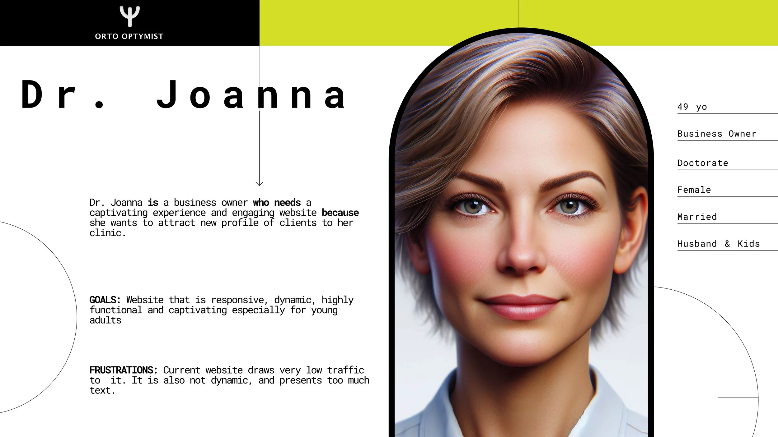
Joanna is a business co-owner who needs a captivating experience and an engaging website because she wants to attract new profile of clients to her clinic.
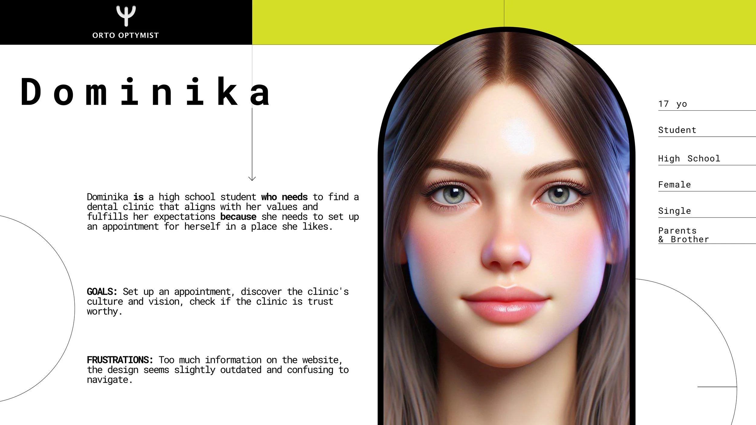
Dominika is a high school student who needs to find a dental clinic that lights up with her values and expectations because she needs to set up an appointment for herself.
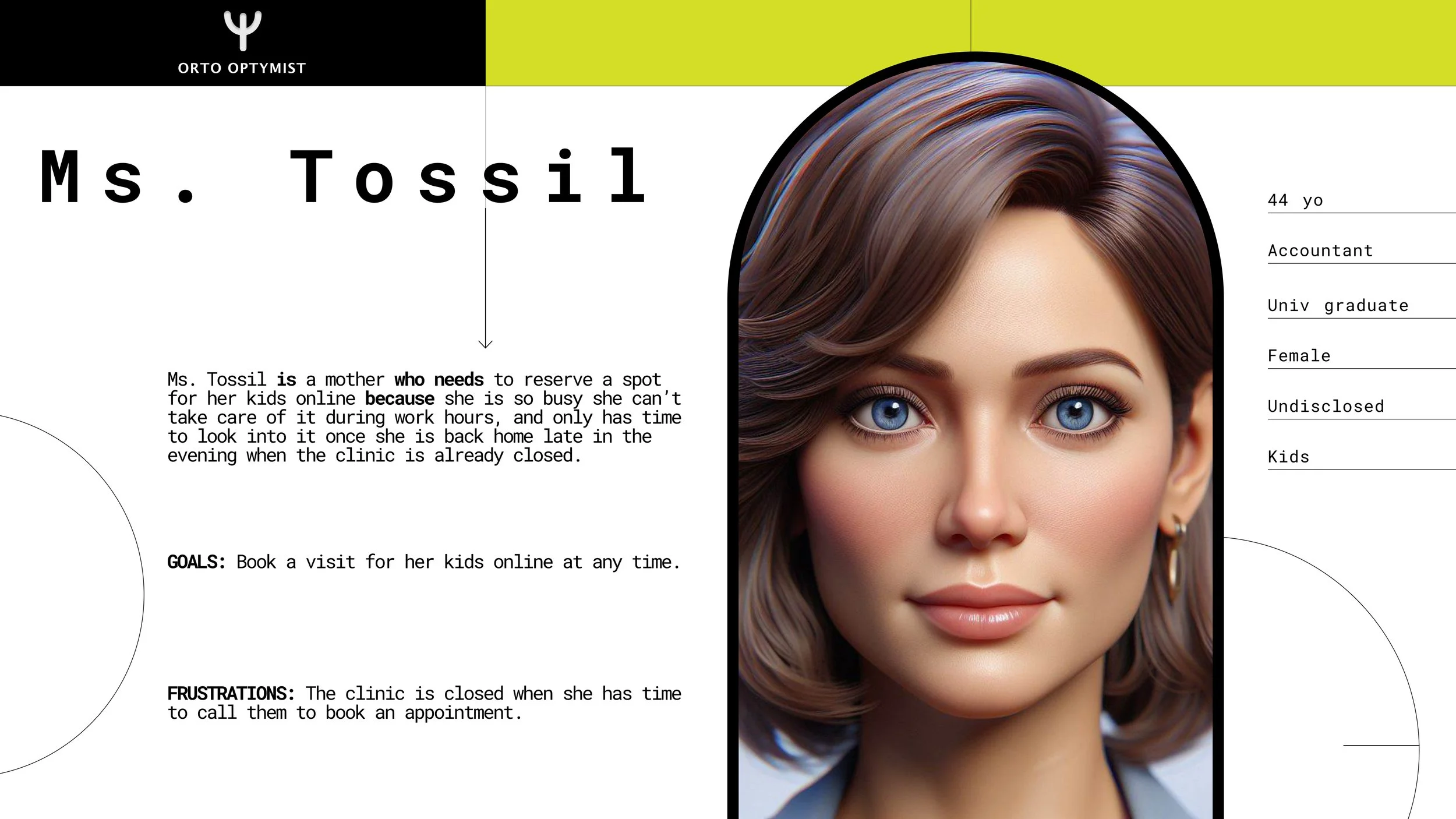
Ms. Tossil is a mother who needs to reserve a place for her kids to visit online because she is so busy she can’t take care of it during work hours and only has time to look into it once she is back home late in the evening when the clinic is already closed.
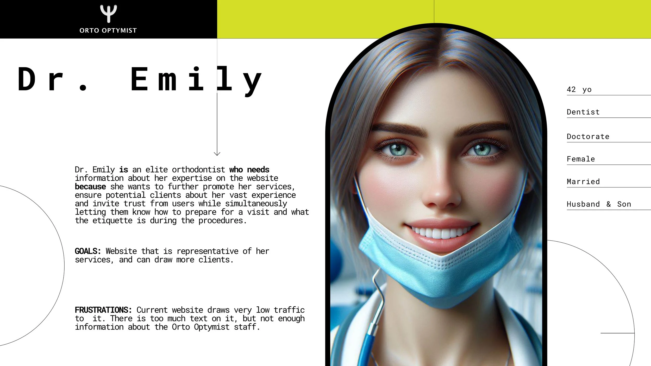
Dr. Emily is an elite orthodontist who needs information about her experience on the website because she wants to further promote her services, ensure potential clients about her vast experience, and invite trust from users while simultaneously letting them know how to prepare for a visit and what the etiquette is during the procedures.
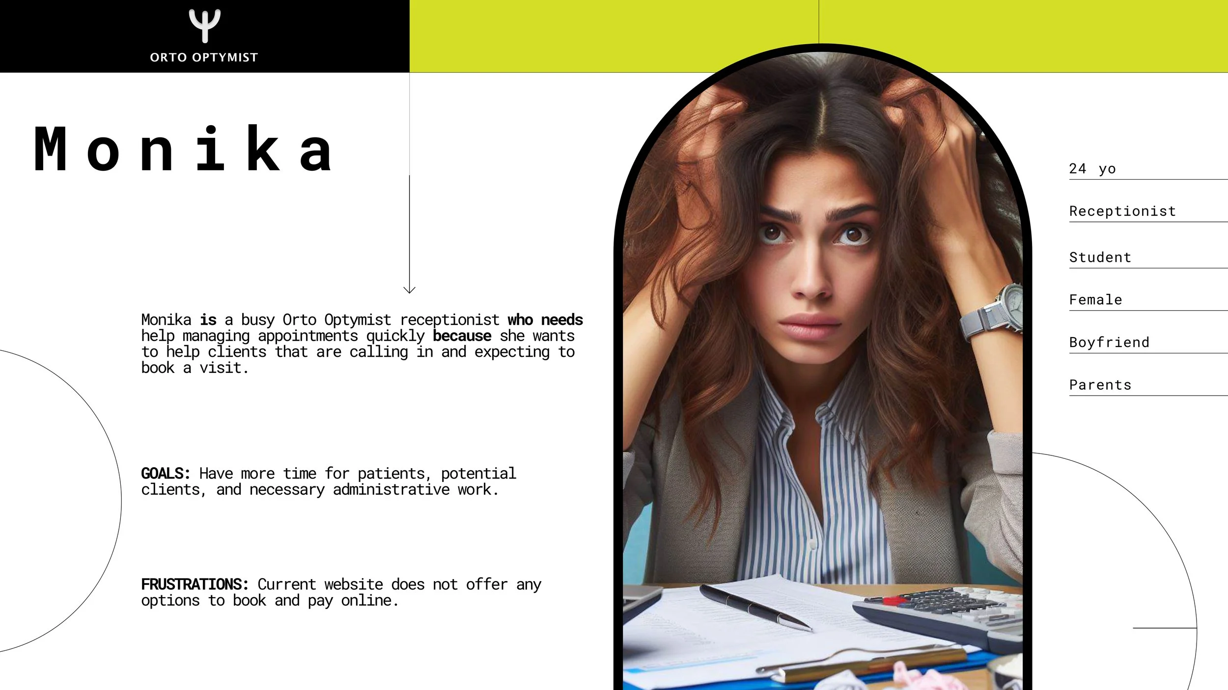
Monika is a busy OO receptionist who needs help managing appointments quickly because she needs to help clients who are calling in and expecting to book a visit.
DESIGN, PROTOTYPE, TEST, IDEATE
DIGITAL WIREFRAMES
Key Assumptions:
A predominant user objective entails seeking contact information and avenues to schedule appointments through the website.
The imperative for the website lies in its capacity to authentically represent the brand and distinguish itself amidst other clinics within the cityscape.
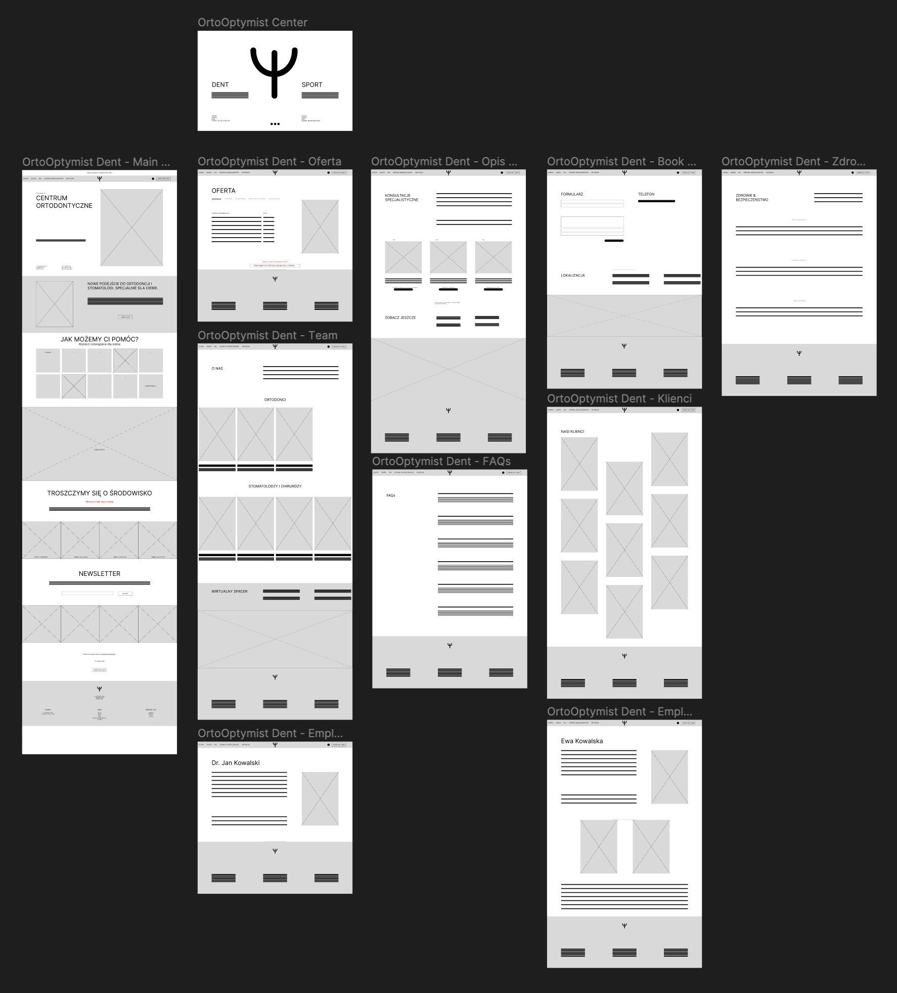
Following a comprehensive discussion with stakeholders and business owners, it became evident that certain adjustments were necessary. The business owners expressed a need for additional features and a subtle modification to the layout. To align with their requirements and adhere to the project budget, a strategic realignment was deemed necessary.
Leveraging my experience in designing websites using Webflow, I identified the platform's functionality as an optimal fit for this project. In an effort to optimize coding efficiency and remain within budgetary constraints, the decision was made to employ one of the templates offered by Webflow. Armed with a clear understanding of the client's specifications and the requisite content hierarchy, a template closely aligned with our design was meticulously selected. Subsequently, I tailored the chosen template to incorporate the client's requests and integrate the specified additional features.
Upon completion of these modifications, I presented the refined hybrid design to the client, eliciting an overwhelmingly positive response. This approach not only satisfied the client's requirements but also ensured a judicious allocation of resources within the project parameters.

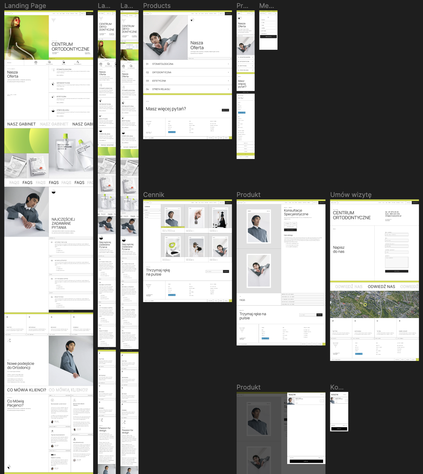
HIGH FIDELITY PROTOTYPE
INFORMATION ARCHITECTURE V.2

SCALABILITY
The prototype was designed with responsive capabilities, ensuring a seamless transition between mobile and desktop devices. It has also been tested for readability at scaled resolutions up to 200%.
ACCESSIBILITY
The website was crafted to meet the needs of WCAG 2.1. It also had extra functions that would allow users to enlarge text and change the contrast.
PROCESS LEARNINGS
〰️
PROCESS LEARNINGS 〰️
TAKEAWAYS
Having a detailed vision of the process and outcome is key to giving clients the confidence they need to reach their goals.
Sometimes, clients want to stick to their own solutions despite our advice as UXers. That's where solid feedback from user testing comes in handy – it helps us show which solution is really the best.
At the start of a project, it's important to set expectations straight. Clients might want to expand the scope and design process without changing the budget, so having those boundaries in place is crucial.
Clients are often super eager to see the final product, and they might be tempted to skip some important parts of the process. That's why we need to talk to them about the importance of each step and make sure we're all on the same page.
IMPLEMENTATIONS
〰️
IMPLEMENTATIONS 〰️
IMPLEMENTED TECHNOLOGIES & TOOLS
Figma, Sketch, Adobe XD, Affinity Photo, Affinity Designer, Affinity Publisher, Photoshop, Illustrator, After Effects, InDesign, DaVinci Resolve, Mirro, Optimal Workshop, Zoom, HTML, CSS, Webflow.
IMPLEMENTED SKILLS SUMMARY
Stakeholder management, user experience, wireframing, prototyping, graphic design, motion graphics, UX research, user testing, interaction design, user-centered design, usability testing, user interface design, information architecture, responsive web design, CSS, HTML, accessible design, responsive web design, leadership, team building, team management, problem-solving.
OTHER CASE STUDIES

Medical University of Lublin
Case Study

SCOP
Case Study